Analyze

Tanio, N_ImperialValleyMural_Stakeholders

ntanio

Ernesto Yerena Montejano, currently a Boyle Heights resident and originally from Imperial County, and his team of fellow artists Arlene Mejorado and Ayerim Leon — complete with friends and families" painted the mura.

It belongs to the Imperial Valley, but was one of 14 California commissions art projects as part of a collaboration between the Governor's Office, CA Dept of Public Health and The Center at Sierra Health Foundation. The commissioning program aimed to raise awareness about Covid19 within the State's hardest hit areas. Each an governmental agency stakeholder in the project along with curators who selected the artist for this mural.

The building's owner, which appears to be a someone poised to sell it soon is also a stakeholder and most importantly, local resident are active stakeholders as they began adding names of family members who died because of Covid on the western corner of the mural unprompted and without explicit instruction or permission.

Tanio, N_ImperialValleyMural

ntanio

The mural is located at 739 N. Imperial Avenue in El Centro. It is precariously positioned because although the current owner of the building has promised to protect it for the next 6 months (per Jun 10, 2021), the next owner of the building may cover over the mural. The mural was completed over 1 week by 5+ painters under the direction of  the artist Ernesto Yerena Montejano on May 30, 2021.

It brings together community members to commorate the toll Covid 19 has taken on the community. It provides a public service message to continue masking and thereby taking care of the community. And it adds an element of beauty and artfulness to what was a run-down building exterior

Tanio, N_ImperialValleyMural_illustrated activities

ntanio

The mural covers the entire side of one building. The background is painted in purples, blue and yellow. One side of the wall is painted "Protege A Nuestra Comunidad!"|"Protect our Community!"

The centerpiece of the mural both figuratively and literally is a beautiful woman (anywhere beteween 20-40yo) in traditional dress with two long strands of brown braided hair holding a bouquet of colorful flowers tied together with a yellow sash. She is wear a face mask to back up the Covid-19 theme.

The flowers she holds is both a reference to the business--"Cynthia's Flower Connection" which has since moved as well as a tribute to the community and their deceased members who died of Covid. One indication is that community members began adding names to the side of the mural as a tribute to lost family members.

This mural is a public-works project commissioned by the State and agencies. It was created by an artist who has ties to the area. It is also meant to be a public health message, another way to reach local residents who have been "locked in"

“Right away we saw how powerful the mural was in bringing people together, especially after this year where we've been locked in and it's been hard to communicate with our community,” he said. Per David Varela, “People are slowly making their way to the mural and are able to mourn a little bit too,” Varela said. “It's really healthy to mourn and I think people are getting a chance to do that through the mural. I knew we'd not only get a beautiful mural, but a powerful message.”

1. WHAT IS THIS DATA RESOURCE CALLED AND HOW SHOULD IT BE CITED?

margauxf

Public Health Alliance of Southern California. California Healthy Places Index. 2019. https://healthyplacesindex.org.


© 2018 Public Health Alliance of Southern California

Permission is hereby granted to use, reproduce, and distribute these materials for noncommercial purposes, including educational, government and community uses, with proper attribution to the Public Health Alliance of Southern California including this copyright notice. Use of this publication does not imply endorsement by the Public Health Alliance of Southern California.

© 2018 California Department of Public Health (CDPH)

Permission is hereby granted to use, reproduce, and distribute these materials for noncommercial purposes, including educational, government, and community uses, with proper attribution to the CDPH, including this copyright notice. Use of this publication does not imply endorsement by the CDPH.

8. How has this data resource been critiqued or acknowledged to be limited?

margauxf

The index does not include certain neighborhood characteristics critical to health because they did not meet the criteria for inclusion (described in question 3). For instance, this included physician ratios (the number of physicians per 100,000 population) because data was missing for a majority of census tracts. In fact, the steering committee was unable to locate much data on health care access or quality at the census-tract level (only data on health care insurance coverage was available).  

 The index was previously critiqued in ways that led to a shift from framing data in terms of “disadvantage” towards a framework of “opportunity”. This led to not only a renaming of the index (from “the Health Disadvantage Index to the Healthy Places Index) but also a shift in reporting of data (e.g. highlight the percentage of the population with a BA degree or higher rather than the percentage of population without a college degree). 

The HPI is also limited in terms of the effects of confounding, with some indicators with strong evidence of health effects showing contrary associations with life expectancy at birth by census tract. The steering committee has also acknowledged that the HPI might not be accurate for census tracts undergoing rapid population change (e.g. due to immigration, rapid gentrification, or other changes).

The HPI notably does not correlate strongly with CalEnviroScreen, which the steering committee for the HPI noted failed to identify one-third of census tracts with the worst conditions for population health. The HPI is ultimately more centered on considering environmental factors as a part of overall health, rather than as a central determinant. However, this disconnect between CalEnviroScreen and the HPI may also be a reflection of the challenges environmental injustice advocates have faced in linking environmental factors to health outcomes (which might not be as visible and geographically direct as the links between health and other indicators).

5. What can be demonstrated or interpreted with this data set?

margauxf

The HPI draws data about 25 community characteristics into a single indexed HPI score. The includes sub-scores for 8 “Policy Action Areas”: Economic, Education, Housing, Health Care Access, Neighborhood, Clean Environment, Transportation, and Social Factors. These scores are meant to be used to evaluate health geographically. Each policy action area includes the following individual indicators and weights:

ECONOMIC (0.32)

  • Poverty
  • Employment
  • Income

EDUCATION (0.19)

  • Pre-school enrollment
  • High school enrollment
  • Bachelors attainment

HEALTHCARE (0.05)

  • Insured adults

HOUSING (0.05)

  • Severe cost burden low income
  • Homeownership
  • Kitchen and plumbing
  • Crowding

NEIGHBORHOOD (0.08)

  • Retail jobs
  • Supermarket access
  • Parks
  • Tree canopy
  • Alcohol establishments

CLEAN ENVIRONMENT (0.05)

  • Diesel PM
  • Ozone
  • PM2.5
  • Drinking water

SOCIAL (0.10)

  • Two parent household
  • Voting

TRANSPORTATION (0.16)

  • Healthy community
  • Automobile access

*The steering committee for the HPI sought to include race/ethnicity as a 9th policy action area, but they were prohibited from doing so by state law which does not allow California state agencies to use race as a basis for public contracting.


The primary HPI Index is designed to align with life expectancy at birth as a predictive measure of community health status. However, the Healthy Places mapping tool can also be used to create custom scores using different indicators. The mapping tool includes detailed definitions of each indicator.

Each indicator is linked to a policy guide, which outlines concrete actions (e.g. best practices, emerging policy options) that local jurisdictions can take to improve HPI indicators. These actions are sometimes aimed at addressing direct links between policy and an action area, and other times aimed at addressed the root causes of an action area. The mapping tool also enables filtering results by “Decision support layers” like health outcomes, health risk behaviors, race/ethnicity, climate change effects, and other layers that the alliance identifies as important for advancing “resilient, equitable communities in California”. Geographies (e.g. census tracts) can also be compared by indicator using a ranking tool. The pool function can be used to create customized aggregations of data to map (e.g. adding several census-tracts together).

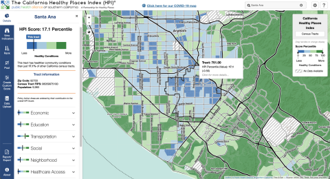
4. What scales (county, regional, neighborhood, census tract) can be seen through this data resource?

margauxf

Data is available at several different scales: census-tracts, congressional districts, state assembly districts, state senate districts, cities, core based statistical areas, elementary school districts, metropolitan planning organization and medical service study areas.  

10. What steps does a user need to take to produce analytically sharp or provocative data visualizations with this data resource?

margauxf

Creating maps by different combinations of indicators or geographic aggregations could be tinkered with to produce provocative data visualizations. Ranking scores can be used to draw distinction between different census tracts. However, clear inequities are evident even without these adjustments, with the HPI index score clearly demonstrating noticeable differences across geographies. 

2. Who makes this data available and what is their mission?

margauxf

The California Healthy Places Index is made available by the Public Health Alliance of Southern California. Their mission is to “make health equity and racial justice a reality” through collaboration and data (https://www.thepublichealthalliance.org/). They engage in advocacy and mobilization to generate this change. They are composed of a coalition of executives representing 10 local health jurisdictions in Southern California (including Long Beach, Los Angeles, Orange, and Riverside, among others), an area they highlight as representing 60% of California’s population (with which they blur the boundaries between “California” and “Southern California”).

The alliance emphasizes pursuing equity using publicly available data and collaboration (with government agencies, legislators, hospitals, health plans, philanthropy, and community advocates). They present the Healthy Places Index (HPI) as a tool for exploring how life expectancy is impacted by community conditions.

More specifically, the HPI was created by a steering committee made up of epidemiologists and 3 public health coalitions led by the alliance.