Analyze

Hawai'i

Misria

The ASTROMOVES project captures the career decision-making of astrophysicists and those in adjacent sciences, with particular attention to ‘intersectional’ identities, sex/gender diversity and visible/invisible disabilities. Qualitative interviews were recorded online (due to the Pandemic) and each scientist was assigned an Indigenous Hawaiian pseudonym. This was a subversive move to remind astrophysicists of the enormous debt they owe to the Hawaiian people for the use of their sacred mountain tops. All of the scientists consented to having a Hawaiian name. Seven scientists chose their own pseudonyms, most were Hawaiian place names: Maui, Waikiki, Waiheke, and Holualoa. Two Brazilians likewise chose Indigenous place names: Caramuru and Paraguaçu. The last name chosen was Kū'oko'a. Kū'oko'a is the Hawaiian concept of freedom, of which I was unaware. When questioned by editors, I had to evoke my Oahu birth as my right to use Hawaiian pseudonyms. For my visualizations, I chose to not use the Mercator projection which artificially enlarges Europe, instead I use the Peters projection or equal area map. Thus, Europe is de-emphasized by showing its area relative to the rest of the world. 

Holbrook, Jarita. 2023. "Visualizing Astrophysicists’ Careers." In 4S Paraconference X EiJ: Building a Global Record, curated by Misria Shaik Ali, Kim Fortun, Phillip Baum and Prerna Srigyan. Annual Meeting of the Society of Social Studies of Science. Honolulu, Hawai'i, Nov 8-11

What quotes from this text are exemplary or particularly evocative?

margauxf

BIOETHNOGRAPHY: “Thus, instead of combining objects of inquiry (biology and culture), I conceived of bioethnography as combining two different methods for knowing the world (Mol 2002, 153)—ethnographic observation and biochemical sampling—in order to ask and answer research questions that could not be addressed through either method alone. This methodological focus involves exploring how our data collection and analysis might be shaped if we suspended the nature/culture binary” (Roberts, 2021, p. 2)

“bioethnography asks, what if we created numbers otherwise, upending the cooked data that reinforces inequality? In fact, bioethnography can enable us to identify structural forces, such as NAFTA and the global health apparatus itself, that are part of the bodily processes that make ill health. In other words, while we know that all data is cooked, it matters how it’s cooked.” (Roberts, 2021, p. 5)

What is the main argument, narrative and effect of this text? What evidence and examples support these?

margauxf

Roberts describes their ongoing bioethnographic collaboration with a team of exposure scientists who are working in environmental engineering and health. Though ethnography is not easily enumerated, Roberts emphasizes that integrating it with quantitative data is worthwhile and makes for “better numbers”. As an example, Roberts describes 3 bioethnographic projects on neighborhoods, water distribution, and employment and chemical exposures. These projects were part of a longitudinal birth-cohort study in Mexico City called Early Life Exposures in Mexico to ENvironmental Toxicants (ELEMENT), created to understand the effects of early-life nutrition and exposure to toxicants (such as lead and phenols). Overtime, this project was expanded to include the study of new toxins (e.g. BPAS, mercury, and fluoride) and new health concerns (e.g. obesity, meopause, sleep).

Roberts’ focus on neighborhoods was produced from the ethnographic observation that neighborhood characteristics might influence exposure levels. Following this observation, Roberts’ and ELEMENT researchers sorted participants by neighborhood and identified significant differences in blood-lead levels. Additionally, Roberts applied previous ethnographic observation and scholarship to argue that high levels of toxicants like lead correlate with the capacity of neighborhoods to withstand other dangers, such as police violence. These findings prompted the development of two new bioethnographic project centered on water and the effect of neighborhood dynamics on health.

9. How has this data resource been critiqued or acknowledged to be limited?

annlejan7

There are missing data points within the dataset (attributed to non-reported information). This dataset has also been acknowledged to be limited in its prioritization of government data, which could have political limitations that may skew the degree of severity for disasters reported. 

8. What can be demonstrated or interpreted with this data set?

annlejan7

This dataset can be used to demonstrate the geographic distribution of disasters in Vietnam over time. This database recognizes multiple dimensions of disaster, including natural (typhoons, hurricanes), technological (a chemical spill, a factory explosion), and more

Image
screenshot_2022-02-22_171315.png
complex disasters such as famine.

6. How has this data resource been used in research and advocacy?

annlejan7

This resource has been used in a publication written by Hoang et al., 2018 on the economic cost of the Formosa Toxic Waste Disaster in Central Vietnam. It is specifically used within the journal article to highlight the forms in which disasters can take place within a nation, and the rising cases of industrial disasters that have afflicted vulnerable communities within the last decade. This characterization sets the stage and context for the Formosa disaster, and integrates it within a wider conversation about the effects of intensified industrialization on the environment. 

5. What steps does a user need to take to produce analytically sharp or provocative data visualizations with this data resource?

annlejan7

These datasets all involve  a strong spatial component. The presentation of such data could best be done via GIS Software, with their integration within a story map to demonstrate the importance of environmental stewardship to natural environments as well as the people who depend on such resources for their livelihoods.  For example, EPI data can be incorporated with EM-DAT’s disaster data to better understand the relationship between  a country’s EPI performance and the amount of technological disasters it observes. A country’s EPI score on Fish Stock Status can be compared with how much the nation’s GDP relies on fisheries to draw attention to discrepancies between stewardship and a country’s reliance on this resource. This process will require a user to be familiar with GIS Software and spatial plotting of data points (as the datasets themselves have not been integrated into ArcGIS), and using this software to integrate information together into meaningful maps.

4. What data visualizations illustrate how this data set can be leveraged to characterize environmental injustice?

annlejan7

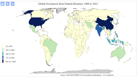
[Source: EM-DAT Public] This graphic shows the prevalence of technological disasters [includes toxic spills, industrial explosions, etc.] by country. This can be used to characterize, on a transnational level, where potential industrial harms are centralized or concentrated. While it does not characterize more insidious harms, such as air pollution, it can be a direct and easy to understand measure of environmental harm distribution across the globe. 

Additionally, data is available as excel sheets, which allows users to produce their own graphics on the prevalence of disasters within a particular nation over a desired time interval. 

3. Who makes this data available and what is their mission?

annlejan7

This was developed in 1988 by personnel from the Center for Research on the Epidemiology of Disasters (CRED) within the Université catholique de Louvain (UCLouvain) with funding from the Belgian government and the World Health Organization (WHO), this data source aims to provide free open access information for users affiliated with academic organizations, non-profits, and international public organizations looking to gain understanding on the distribution  of disaster occurrences around the globe.