Analyze

NIEHS Dashboard Data Sources

tschuetz

GitHub Repository

“To empower additional modeling efforts, the complete time series of all daily PVI scores and data are available at https://github.com/COVID19PVI/data. “

12 Key Indicators

“[The authors] assembled U.S. county- and state-level datasets into 12 key indicators across four major domains: current infection rates (infection prevalence, rate of increase), baseline population concentration (daytime density/traffic, residential density), current interventions (social distancing, testing rates), and health and environmental vulnerabilities (susceptible populations, air pollution, age distribution, comorbidities, health disparities, and hospital beds).”

Three types of modeling

“Our modeling efforts directly address the discussion in [6], by contextualizing factors such as racial differences with corrections for socioeconomic factors, health resource allocation, and co-morbidities, plus highlighting place- based risks and resource deficits that might explain spatial distributions. Specifically, three types of modeling efforts were performed and are regularly updated. First, epidemiological modeling on cumulative case- and death-related outcomes provides insights into the epidemiology of the pandemic. Second, dynamic time-dependent modeling provides similar outcome estimates as national-level models, but with county-level resolution. Finally, a Bayesian machine learning approach provides data-driven, short-term forecasts. “

Blackness and PM 2.5

“With respect to factors affecting COVID-19 related mortality, we find that the proportion of Black residents and the PM2.5 index of small-particulate air pollution are the most significant predictors among those included, reinforcing conclusions from previous reports[7]. An increase of one percentage point of Black residents is associated with a 3.3% increase in the COVID-19 death rate. The effect of a 1 g/m3 increase in PM2.5 is associated with an approximately 16% increase in the COVID-19 death rate, a value at the high end of a previously reported confidence interval from a report in late April 2020[7] when deaths had reached 38% of the current total.”

Machine learning and prediction

“To accurately predict future cases and mortality, it is necessary to account for the fluid nature of the data. Accordingly, we developed a Bayesian spatiotemporal random-effects model that jointly describes the log-observed and log-death counts to build local forecasts. Log-observed cases for a given day are predicted using known covariates (e.g., population density, social distancing metrics), a spatiotemporal random-effect smoothing component, and the time- weighted average number of cases for these counts. This smoothed time-weighted average is related to a Euler approximation of a differential equation; it provides modeling flexibility while approximating potential mechanistic models of disease spread. The smoothed case estimates are used in a similar spatiotemporal model predicting future log-death counts based on a geometric mean estimate of the estimated number of observed cases for the previous seven days as well as the other data streams. The resulting county-level predictions and corresponding confidence intervals are shown (Fig. 1)."

Source: https://www.researchgate.net/publication/343642027_The_COVID-19_Pandemi…

US NIEHS Dashboard Creators and Curators

tschuetz

Skylar W. Marvel1, John S. House2, Matthew Wheeler2, Kuncheng Song1, Yihui Zhou1, Fred A. Wright1,3, Weihsueh A. Chiu4, Ivan Rusyn4, Alison Motsinger-Reif2*, David M. Reif1*

Affiliations:

1 Bioinformatics Research Center, Department of Biological Sciences, North Carolina State University, Raleigh, NC 27695, USA.

2 Biostatistics and Computational Biology Branch, National Institute of Environmental Health Sciences, Research Triangle Park, NC, 27709, USA.

3 Department of Statistics, North Carolina State University, Raleigh, NC 27695, USA

4 Veterinary Integrative Biosciences, College of Veterinary Medicine and Biomedical Sciences, Texas A&M University, College Station, TX 77845, USA.

US NIEHS Dashboard Types of Data

tschuetz

“Data sources in the current model (version 11.2.1) include the Social Vulnerability Index (SVI) of the Centers for Disease Control and Prevention (CDC) for emergency response and hazard mitigation planning (Horney et al. 2017), testing rates from the COVID Tracking Project (Atlantic Monthly Group 2020), social distancing metrics from mobile device data ( https://www.unacast.com/covid19/social-distancing-scoreboard), and dynamic measures of disease spread and case numbers ( https://usafacts.org/issues/coronavirus/). Methodological details concerning the integration of data streams—plus the complete, daily time series of all source data since February 2020 and resultant PVI scores—are maintained on the public Github project page (COVID19PVI 2020). Over this period, the PVI has been strongly associated with key vulnerability-related outcome metrics (by rank-correlation), with updates of its performance assessment posted with model updates alongside data at the Github project page (COVID19PVI 2020).”

Source: https://ehp.niehs.nih.gov/doi/10.1289/EHP8690

US NIEHS Dashboard Motivations

tschuetz

Empowering local actoors

“We present the PVI Dashboard as a dynamic container for contextualizing these disparities. It is a modular tool that will evolve to incorporate new data sources and analytics as they emerge (e.g., concurrent flu infections, school and business reopening statistics, heterogeneous public health practices). This flexibility positions it well as a resource for integrated prioritization of eventual vaccine distribution and monitoring its local impact. The PVI Dashboard can empower local and state officials to take informed action to combat the pandemic by communicating interactive, visual profiles of vulnerability atop an underlying statistical framework that enables the comparison of counties and the evaluation of the PVI’s component data.”

US NIEHS Dashboard Visualization

tschuetz

Built with toxicology knowledge

“The software used to generate PVI scores and profiles from these data is freely available at https://toxpi.org

General visualization capabilities

“The interactive visualization within the PVI Dashboard is intended to communicate factors underlying vulnerability and empower community action [...] The visualization and quantification of county-level vulnerability indicators are displayed by a radar chart, where each of the 12 indicators comprises a “slice” of the overall PVI profile. On loading, the Dashboard displays the top 250 PVI profiles (by rank) for the current day. The data, PVI scores, and predictions are updated daily, and users can scroll through historical PVI and county outcome data. Individual profiles are an interactive map layer with numerous display options/filters that include sorting by overall score, filtering by combinations of slice scores, clustering by profile similarity (i.e. vulnerability “shape”), and searching for counties by name or state (Additional functionality is detailed in the Supplement). User selection of any county overlays the summary Scorecard and populates surrounding panels with county- specific information (Figure 1). The scrollable panels at left include plots of vulnerability drivers relative to the nation-wide distribution across all U.S. counties, with the location of the selected county delineated. The panels across the bottom of the Dashboard report cumulative county numbers of cases and deaths; timelines of cumulative cases, deaths, PVI score, and PVI rank; daily changes in cases and deaths for the most recent 14-day period (commonly used in reopening guidelines[6]; and predicted cases and deaths for a 7-day forecast horizon.”

Visualizing comparison and "peer counties"

“the multi-criteria filtering capabilities in the Dashboard were used to find a “peer county” for comparison. “

Source: https://ehp.niehs.nih.gov/doi/10.1289/EHP8690 and https://www.researchgate.net/publication/343642027_The_COVID-19_Pandemi…

7. How has this data resource been used in research and advocacy?

margauxf

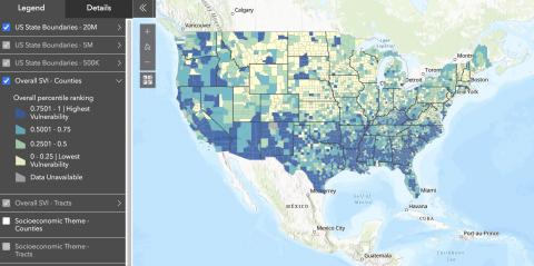
The SVI has been used to assess hazard mitigation plans in the southeastern US, evaluate social vulnerability in connection to obesity, explore the impact of climate change on human health, create case studies for community resilience policy, and even to look beyond disasters in examining a community’s physical fitness. 

The SVI was also used by public health researchers to explore the association between vulnerability and covid-19 incidence in Louisiana Census Tracts. Previous research examining associations between the CDC SVI and early covid-19 incidence had mixed results at a county level, but Biggs et al.’s study found that all four CDC SVI sub-themes demonstrated association with covid-19 incidence (in the first six months of the pandemic). Census tracts with higher levels of social vulnerability experienced higher covid-19 incidence rates. Authors of this paper point to the long history of racial residential segregation in the United States as an important factor shaping vulnerability and covid-19 incidence along racialized lines, with primarily Black neighborhoods typically most disadvantaged relative to primarily white neighborhoods. The compounding factors shaping vulnerability along racialized lines—high rates of poverty, low household income, and lower educational attainment—are identified as shaping the likelihood of covid-19 infection. The authors encourage policy initiatives that not only mitigate covid-19 transmission through allocation of additional resources and planning, but that also “address the financial and emotional distress following the covid-19 epidemic among the most socially vulnerable populations” (Biggs et al., 2021).

Image
relationship between social vulnerability and covid-19 Louisiana

Biggs, Erin N., Patrick M. Maloney, Ariane L. Rung, Edward S. Peters, and William T. Robinson. 2021. “The Relationship Between Social Vulnerability and COVID-19 Incidence Among Louisiana Census Tracts.” Frontiers in Public Health 8. https://www.frontiersin.org/article/10.3389/fpubh.2020.617976.

Lehnert, Erica Adams, Grete Wilt, Barry Flanagan, and Elaine Hallisey. 2020. “Spatial Exploration of the CDC’s Social Vulnerability Index and Heat-Related Health Outcomes in Georgia.” International Journal of Disaster Risk Reduction 46 (June): 101517. https://doi.org/10.1016/j.ijdrr.2020.101517.

Responsive Curriculums

prerna_srigyan
  • The process of designing curriculum is quite useful as it details how different activities correspond to learning goals in science, mathematics, and technology. Fig. 3 describes the steps: selecting content through content specialists in the POAC team, making a curriculum outline, individual meetings with content specialists, and making the lesson plans. I really like the activities they designed, such as comparing different mask materials and how they protected against differently-sized viruses. They were also given time to research career pathways and present on epidemiology careers, a step that invites students to imagine career pathways. 

  • I realize the scope and audience of this paper is different, but I am so curious about how the Imhotep Academy created a setting that encouraged underrepresented students to participate and speak up, given that they cite evidence of how difficult that can be. How did they choose participants? 

  • Having read Freire’s Pedagogy of the Oppressed recently, I am thinking about his approach to curriculum design that is based on a feedback loop between would-be learners and would-be educators. The roles of learners and educators aren’t fixed. Content development is not done beforehand just by content specialists but in an iterative process with multiple feedback loops. Since very few research teams have the time or the resources to deploy Freire’s rigorous approach, I am not surprised that most curriculum development does not follow the route. And educators are working with former experiences anyway. So I am curious about how the authors’ previous experiences shaped their approach to curriculum design?

  • A context for this paper is the controversy on the proposed revisions to the California math curriculum that conservative media outlets argue “waters down” calculus–a cherry topping on the college admissions cake–to privilege data science in middle-school grades. Education researchers contend that apart from physics and engineering majors, not many colleges actually require calculus for admissions (many private institutions do), and that the relevance of advanced calculus for college preparation is overrated. 

  • National Commission on Excellence in Education ‘s 1983 report Nation At Risk: the need for a new STEM workforce specializing in computer science and technology 

  • National Council on Mathematics 2000 guidelines for preparing American students for college in Common Core Mathematics 

  • Stuck in the Shallow End: Virtual segregation; Inequality in learning computer science in American schools focusing on Black students 

8. How has this data resource been critiqued or acknowledged to be limited?

margauxf

The CDC SVI has been acknowledged to be limited in capturing accurate representations of small-area populations that experience rapid change between censuses (e.g. New Orleans in the years following Hurricane Katrina).

The Index is also limited, like other mapping tools, by the lack of homogeneity within any census tract or county/parish. There may very well be more vulnerable communities and individuals living in overall less vulnerable areas. Homeless populations may also specifically not be represented within studies that rely on geocoding by residential address. Length of residence within a geographic area may also impact results.  

The index is also limited by calculations that account for where people live, but not necessarily where they work or play. The lives of individuals are not necessarily restricted to the boundaries of a census tract or county/parish. 

Lastly, vulnerability is only one component of several components that are important for public health officials and policymakers to consider—the hazard itself, the vulnerability of physical infrastructure, and community assets and resources are other elements that must be taken into account for reducing the effects of a hazard.

This data resource has also been critiqued by Bakkensen et al. for not having been explicitly tested and empirically validated to demonstrate that the index performs well (a problem they identify as characterizing multiple indices).

Bakkensen, Laura A., Cate Fox-Lent, Laura K. Read, and Igor Linkov. 2017. “Validating Resilience and Vulnerability Indices in the Context of Natural Disasters.” Risk Analysis 37 (5): 982–1004. https://doi.org/10.1111/risa.12677.