Analyze

Responsive Curriculums

prerna_srigyan
  • The process of designing curriculum is quite useful as it details how different activities correspond to learning goals in science, mathematics, and technology. Fig. 3 describes the steps: selecting content through content specialists in the POAC team, making a curriculum outline, individual meetings with content specialists, and making the lesson plans. I really like the activities they designed, such as comparing different mask materials and how they protected against differently-sized viruses. They were also given time to research career pathways and present on epidemiology careers, a step that invites students to imagine career pathways. 

  • I realize the scope and audience of this paper is different, but I am so curious about how the Imhotep Academy created a setting that encouraged underrepresented students to participate and speak up, given that they cite evidence of how difficult that can be. How did they choose participants? 

  • Having read Freire’s Pedagogy of the Oppressed recently, I am thinking about his approach to curriculum design that is based on a feedback loop between would-be learners and would-be educators. The roles of learners and educators aren’t fixed. Content development is not done beforehand just by content specialists but in an iterative process with multiple feedback loops. Since very few research teams have the time or the resources to deploy Freire’s rigorous approach, I am not surprised that most curriculum development does not follow the route. And educators are working with former experiences anyway. So I am curious about how the authors’ previous experiences shaped their approach to curriculum design?

  • A context for this paper is the controversy on the proposed revisions to the California math curriculum that conservative media outlets argue “waters down” calculus–a cherry topping on the college admissions cake–to privilege data science in middle-school grades. Education researchers contend that apart from physics and engineering majors, not many colleges actually require calculus for admissions (many private institutions do), and that the relevance of advanced calculus for college preparation is overrated. 

  • National Commission on Excellence in Education ‘s 1983 report Nation At Risk: the need for a new STEM workforce specializing in computer science and technology 

  • National Council on Mathematics 2000 guidelines for preparing American students for college in Common Core Mathematics 

  • Stuck in the Shallow End: Virtual segregation; Inequality in learning computer science in American schools focusing on Black students 

9. How has this data resource been critiqued or acknowledged to be limited?

annlejan7

There are missing data points within the dataset (attributed to non-reported information). This dataset has also been acknowledged to be limited in its prioritization of government data, which could have political limitations that may skew the degree of severity for disasters reported. 

8. What can be demonstrated or interpreted with this data set?

annlejan7

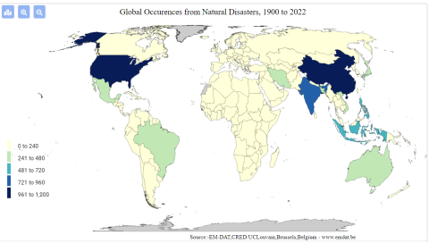
This dataset can be used to demonstrate the geographic distribution of disasters in Vietnam over time. This database recognizes multiple dimensions of disaster, including natural (typhoons, hurricanes), technological (a chemical spill, a factory explosion), and more

Image
screenshot_2022-02-22_171315.png
complex disasters such as famine.

6. How has this data resource been used in research and advocacy?

annlejan7

This resource has been used in a publication written by Hoang et al., 2018 on the economic cost of the Formosa Toxic Waste Disaster in Central Vietnam. It is specifically used within the journal article to highlight the forms in which disasters can take place within a nation, and the rising cases of industrial disasters that have afflicted vulnerable communities within the last decade. This characterization sets the stage and context for the Formosa disaster, and integrates it within a wider conversation about the effects of intensified industrialization on the environment. 

5. What steps does a user need to take to produce analytically sharp or provocative data visualizations with this data resource?

annlejan7

These datasets all involve  a strong spatial component. The presentation of such data could best be done via GIS Software, with their integration within a story map to demonstrate the importance of environmental stewardship to natural environments as well as the people who depend on such resources for their livelihoods.  For example, EPI data can be incorporated with EM-DAT’s disaster data to better understand the relationship between  a country’s EPI performance and the amount of technological disasters it observes. A country’s EPI score on Fish Stock Status can be compared with how much the nation’s GDP relies on fisheries to draw attention to discrepancies between stewardship and a country’s reliance on this resource. This process will require a user to be familiar with GIS Software and spatial plotting of data points (as the datasets themselves have not been integrated into ArcGIS), and using this software to integrate information together into meaningful maps.

4. What data visualizations illustrate how this data set can be leveraged to characterize environmental injustice?

annlejan7

[Source: EM-DAT Public] This graphic shows the prevalence of technological disasters [includes toxic spills, industrial explosions, etc.] by country. This can be used to characterize, on a transnational level, where potential industrial harms are centralized or concentrated. While it does not characterize more insidious harms, such as air pollution, it can be a direct and easy to understand measure of environmental harm distribution across the globe. 

Additionally, data is available as excel sheets, which allows users to produce their own graphics on the prevalence of disasters within a particular nation over a desired time interval. 

3. Who makes this data available and what is their mission?

annlejan7

This was developed in 1988 by personnel from the Center for Research on the Epidemiology of Disasters (CRED) within the Université catholique de Louvain (UCLouvain) with funding from the Belgian government and the World Health Organization (WHO), this data source aims to provide free open access information for users affiliated with academic organizations, non-profits, and international public organizations looking to gain understanding on the distribution  of disaster occurrences around the globe.

2. What data is drawn into the data resource and where does it come from?

annlejan7

The EMT disaster database is compiled from a wide variety of sources, including UN agencies, NGOs, insurance companies, research institutes, and press agencies. The dataset compilation process prioritizes data from UN agencies, the International Federation of Red Cross and Red Crescent Societies, and government agencies. Entries are reviewed prior to consolidation, and this process of checking and incorporating data is done on a daily basis. More routined  data checking and management also occurs at a monthly interval, with revisions made at the end of each year.